On the 9th of September Toggl, my then time tracking app of choice, rebranded the company structure and … the design.
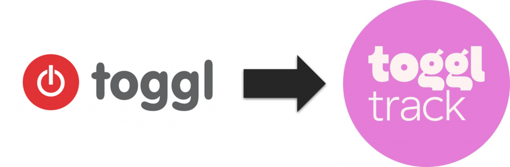
On that morning, I noticed that the icon of the Toggl Chrome extension suddenly had a pink background. My through was, that someone had mixed up some image formats and the pink color was supposed to be a magenta mask, like it was used for sprites sheets back in the days of old image formats. But the longer the day was, the more I realized that they changed colors and that everything in Toggl Track is now pink.
Think of an everyday customer of a time tracking app. I don’t have the data to say who that is, but my guess is, that those who need time tracking, are probably using it for their profession or maybe as a student. Then again, maybe I’m biased, as I used Toggl during my studies in 2016 and been using it ever since, be it for small customer projects and during my day job. What seems to be a more professional color scheme: red/gray/white or pink/violet/purple?
My point here isn’t that you can never use pink for a tool or a company logo (see the logo of the company I work for), no, my point is much more about rebranding based on user feedback.
Know Your Customer
When you’re in the midst of a whole company rebranding, it’s easy to forget what really matters. As a service/product company your company image is only important as far as it attracts new customers and retains existing customers, i.e. your focus should always be on the customer. So really ask yourself the following two questions:
In what way is the new design more attractive for new customers than the old one?
How does the new design serve the existing customer?
As with everything in engineering and beyond, do not assume anything. Just because you like it, the whole product team likes it (except Steve), your friends and family pretend to like it, doesn’t mean that your customers will also like it. Of course it takes more work to do some user testing, to get feedback from some of your users, maybe even do some A/B testing or allow an opt-in preview mode. If you don’t ask your customers, how can you really be focusing on your customers?
Since I don’t work for Toggl, I of course don’t know if or how much user testing they did before the release, but given the tons and tons of negative feedback (check their Facebook page or Twitter account and that’s just on the surface) it’s a clear indication that they either
- didn’t ask for any feedback at all,
- didn’t ask a large enough group
- or ignore all the negativ feedback.
Another clear indication that they didn’t do their due diligence is the blog post update, where they pretend the alternative color schemes are only needed because of accessibility, and the fact that they started to already promise future changes on the same day it was released via support:
Sorry to hear and to disappoint but the colors cannot be changed at this time. However, due to feedback such as yours, we’re looking into the possibility of adding a theme switcher to the web app so I hope to have some good news for you soon.
Toggl Support Team
Having seen behind the curtain of some companies, I know that the support representatives aren’t going to promise future changes, unless there has already been a meeting (with managers and executives), where ideas were brainstormed and a possible solution was picked.
Summary
Just to reiterate, if you plan to do a lot of changes to any of your products, make sure you know your customers, not only by pretending to know them, but by actively asking them for feedback and input. You’ll save yourself a lot of embarrassment and stress.
Personally, I’ve closed my Toggl account and started using Clockify, not just because I find their icon quite ugly, but also because I’m not really dependent on Toggl’s features and I don’t like using tools from companies, that don’t put the customer first. So far I’m very happy with Clockify. It feels a lot snappier, it has one of the fastest sign-up form I’ve seen in a while and the Android app so far didn’t have any of the syncing issues I ran into a lot with Toggl.
Twitter thread on the topic:
To this day, I cringe every time I have to use Toggl. Finding a whole article dissecting their awful rebranding decision feels very validating. I think I’ll check out Clockify—thank you :D
Also good to hear that I’m not the only one that still can’t deal with the rebranding. :D
But I guess it worked out for them in some ways? The interesting part is that all iOS power users aren’t really bothered by this, as they all use a separate app, which is way better than the official one.
The only downside with Clockify for me currently is that, it doesn’t have an app for the Stream Deck (yet). But when I get a bit more room, I’ll try to fix that. :)
Without the new branding and logo I probably wouldn’t have started using Toggl. I think it’s a fresh design among lot’s of ugly and boring, as well as confusing designs from many professional softwares.
The rebrand was also made by a big bureau with a lot of experience.